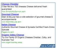
Ever since I began blogging WAY back in the t days of Blogger, Adsense was and has remained one of the most common means of generating revenue for blogs and websites.
Some bloggers swear by tried and true methods that can drastically improve your click-through rate and overall earnings simply by positioning the ads optimally, by improving the targeting content or by tweaking the ad units.
Here are a seven methods you might try to optimize your own Adsense units:
1. The three top performing ad units are: 336×280 large rectangle, 300×250 inline rectangle and 160×600 wide skyscraper. Try using those units, but keep in mind that other formats could be more suitable for your personal design.
2. The most successful link color is blue. This fact goes back to the very roots of the Internet in that all major websites used to feature blue links.
3. Besides blue links you might try a link color that coordinates nicely with the design of your website (i.e. If you use red links make the Adsense links of the same color).
4. As a general rule of thumb, blend (no border, same background) your Adsense units if your blog has a light color theme and contrast (border, contrasting background) the units if you are using a dark color theme.
5. If the ads are placed within the content it’s recommended you avoid using borders while ad units outside of the content can use borders to call attention.
6. If your blog consists mainly of repeat visitors as in websites that utilize forums, you should consider rotating the background color of the units to reduce ad blindness
7. And I can’t say it enough – test, test, test! Every website, blog and visitor is unique so make sure you experiment with different colors and formats and track the results so you can fine tune your Adsense units.
What are some methods or ad servers you’ve tried that have shown the greatest result?


Leave a Reply