I’m not sure about the rest of the web surfing population but when I happen on a website the first thing I look for is a brief description that tells me what the site is all about to determine whether I want to visit for a bit, click around and read the offerings or if I want to click BACK and continue on to the next stop.
These very key descriptions happen in one of two places
1. Browser Search Results
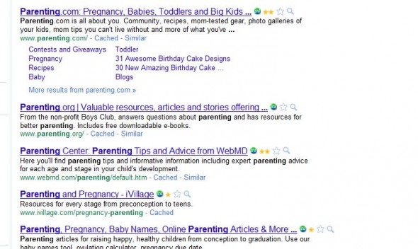
When searching for a simple term, let’s use “parenting” as an example, the first thing you notice are the “descriptive lines” that appear in hyperlink blue.
You will notice the terms Babies, Toddlers, Big Kids, Parenting Tips from WebMD, etc.
If you are a parent looking for advice on teenagers, you’re not likely to visit any of these sites because their descriptions clearly let you know, they don’t have what you are looking for.
2. Actual Website Visit
Now, just for kicks I clicked through to page 12 of the same search because that’s usually where good websites with bad descriptions end up – not necessarily on page 12 exactly, but well beyond page 2 or 3.
What I found was hyperlink blue text that simply says “Parenting” “Parenting Counts” and, well, you get the picture. At a glance, those descriptions tell me nothing about what I will find on those pages, so I’m not likely to click through to visit them and I’m guessing, you wouldn’t either.
Let’s just say – In the off chance I were to click through to one of those, I would hope to find something on their front page that would tell me more of what their website is about.
To continue with this test-drive I did just that. I clicked through to the link that simply said “Parenting.” What I found was a really great website that provides very helpful resources for families dealing with mental illness and addictions. Their slogan is “Healing Hearts and Minds of Children and Their Families.”
If someone would simply take the time to place THAT slogan in the “title” portion of their site, surfers would have some idea of what this particular “Parenting” site was about. Healing Hearts and Minds tells me it’s got to do with dysfunction of some sort.
Since this our primary focus here is “blogging” I am going to tell you, as a blogger, how to fix this issue on your WordPress blog.
You will notice on my personal blog, the extreme top of the page says “Work at Home Resources, Tips, Jobs, Scams Discussion & Services” I want to leave absolutely NO doubt what my blog is about. Notice at the top of this very page, Freelance Writing Jobs | A Freelance Writing Community and Freelance Writing Jobs Resource – still, no doubt what this blog is about. Right?
How did we get that to read that way?
Go to your WordPress Dashboard >>> Settings >>> Site Title – type in your title, slogan, tagline or description then Save Changes.
It’s really that simple to create that one tiny fix that could mean the difference between a reader clicking through to you or not.
These descriptions are not to be confused with individual page or post titles. When it comes to those, I follow one simple rule – always imagine your RSS subscribers. If they are combing through all the new posts over their morning coffee – does your title offer them enough to make them want to click on through to read or will they simply pass you by? But, that’s another topic for another day.
Are you stumped on a description? Not sure if your title is descriptive enough? Leave a comment and I’ll check it out and let you know what I think – be sure to state what platform you use if it’s different from WordPress.
As always, I am committed to my readers. If you leave a comment on any of my posts, I will visit your blog and “share it” in some way whether on StumbleUpon, Twitter or Facebook depending on if I can find a nice fit. This is my way of saying thank you!


Leave a Reply